
Why the button matches the site
The reaction button is not styled per site. It measures the controls already in the row and copies them, which is why it looks native on sites nobody wrote a theme for.
See it for yourself
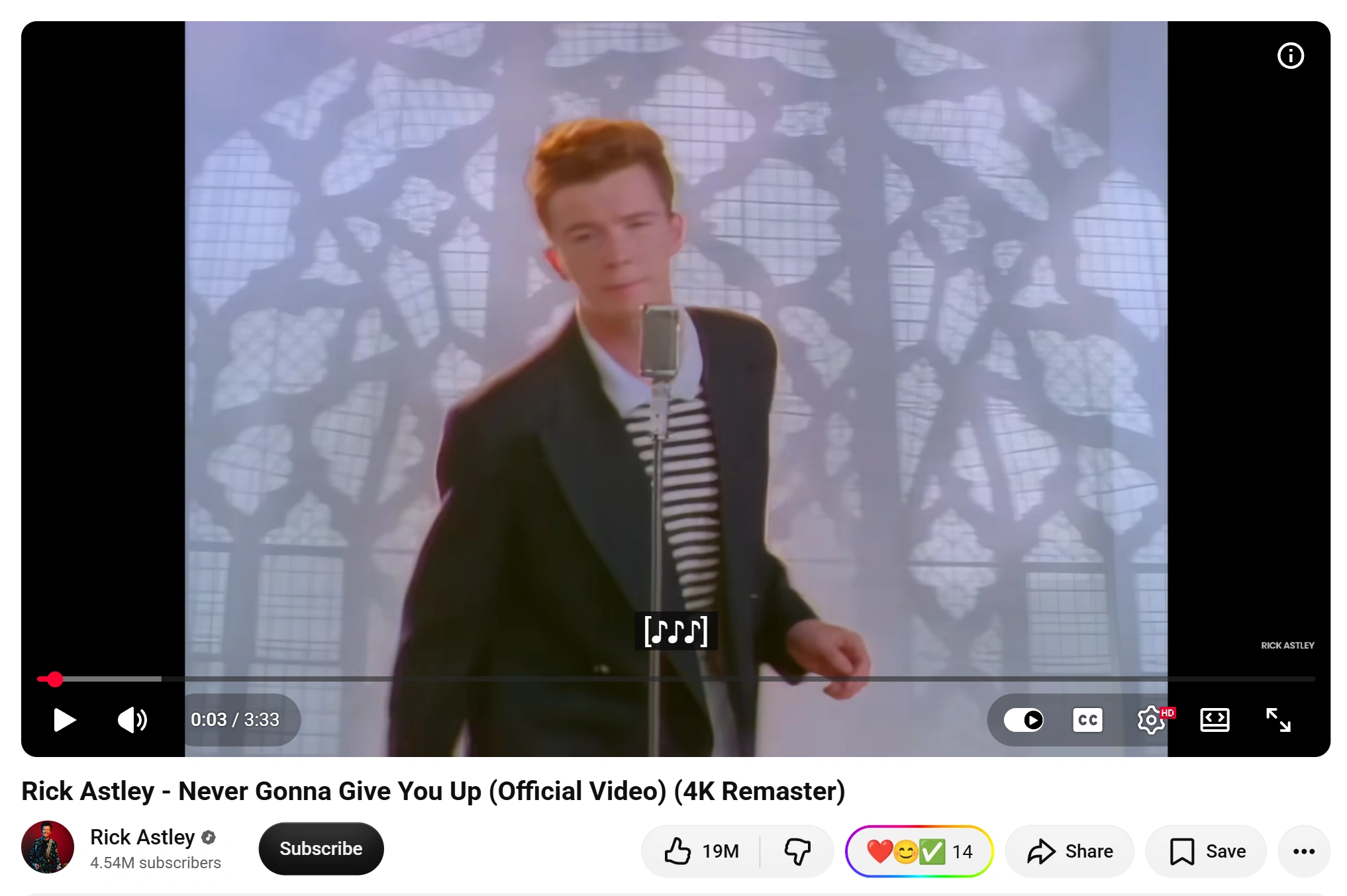
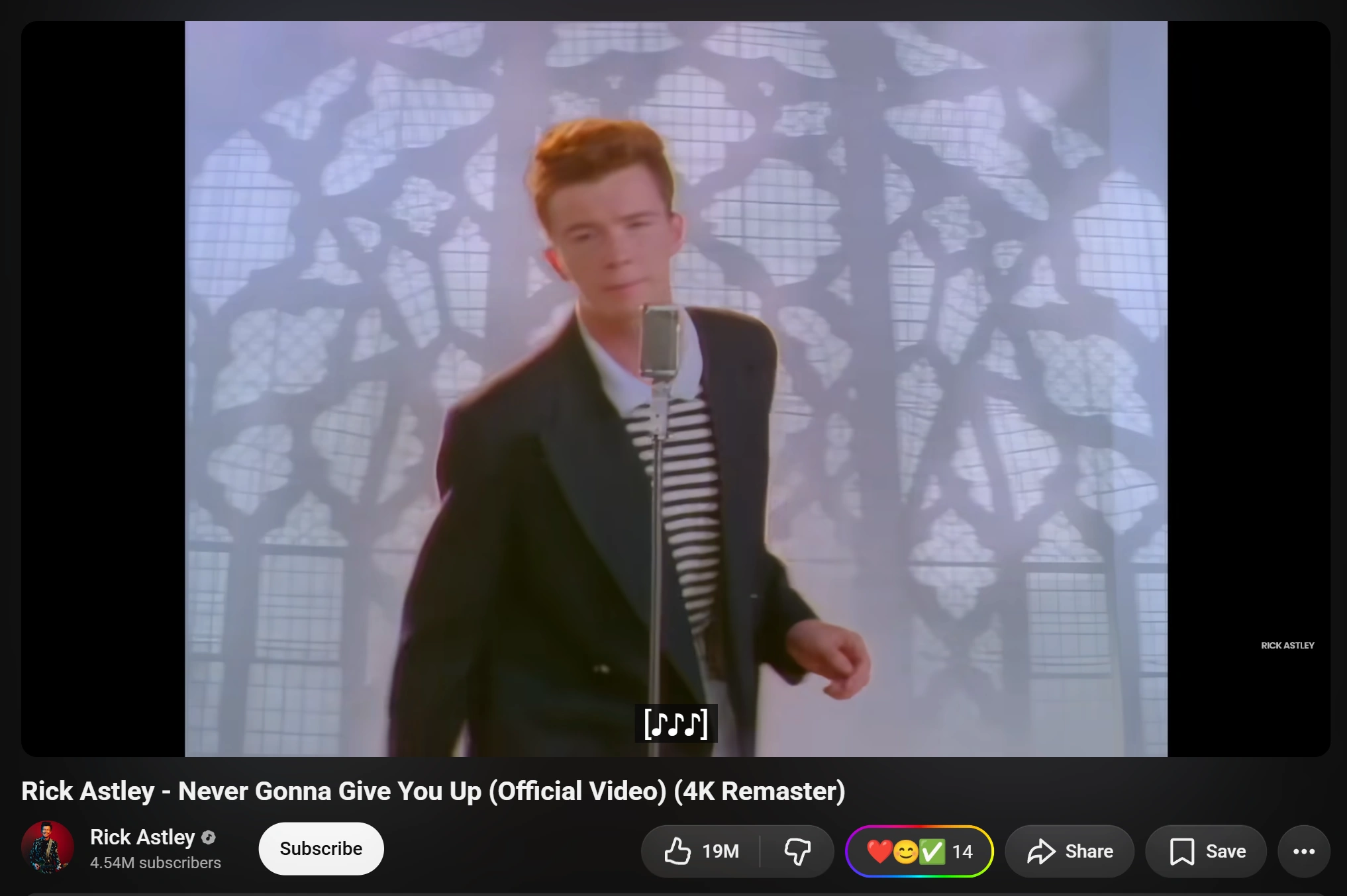
The quickest proof is a site with its own theme switch.
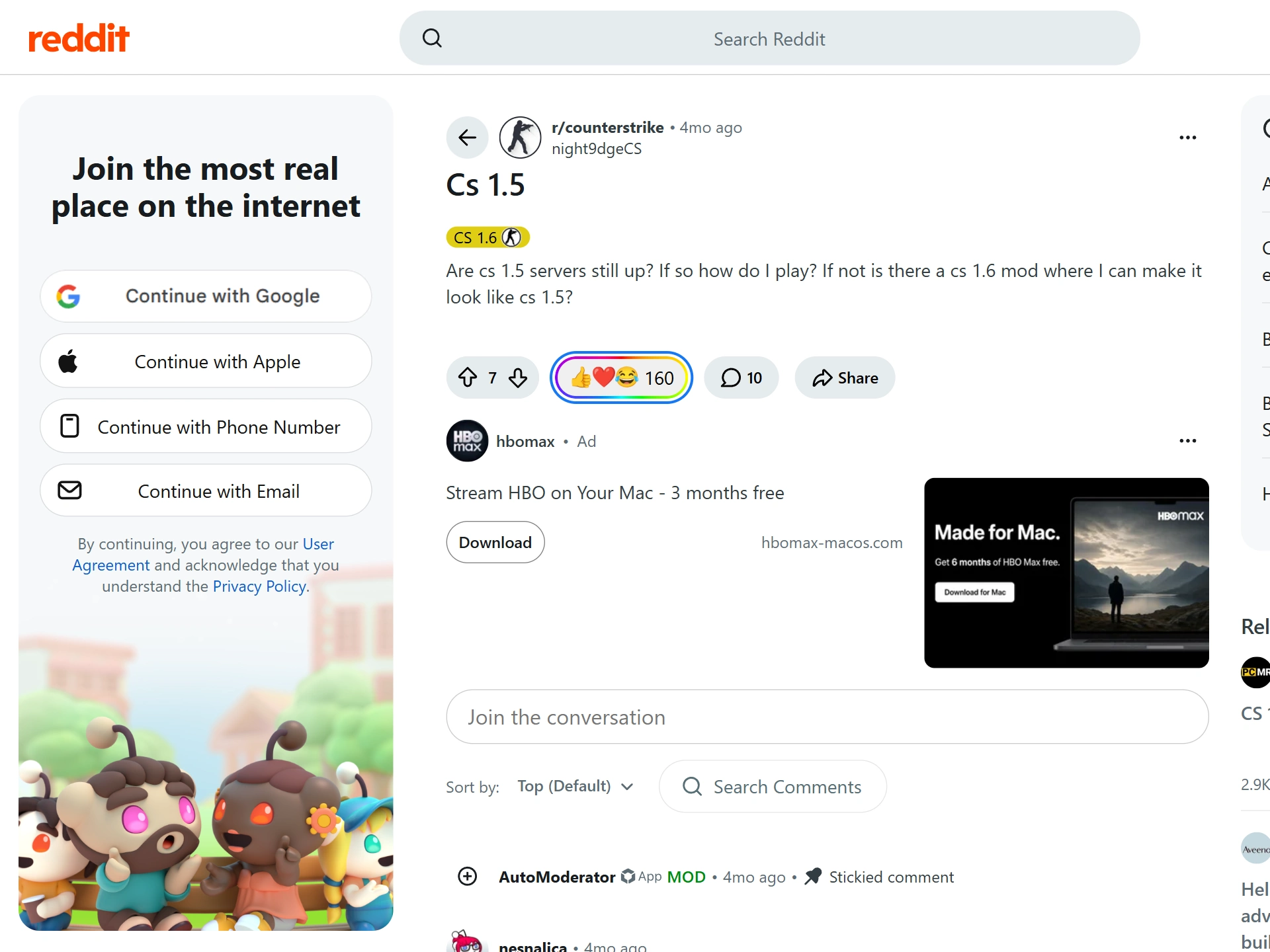
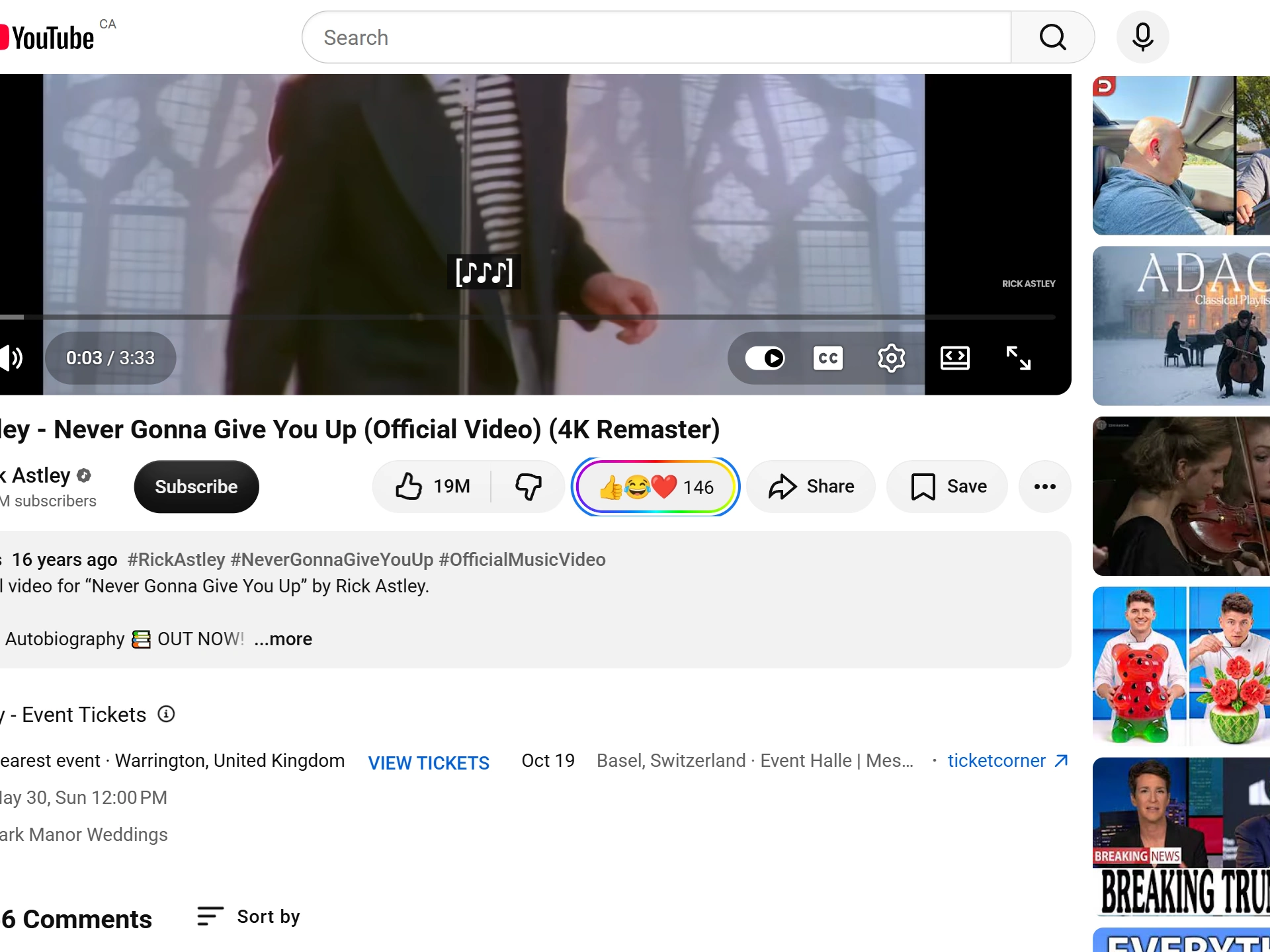
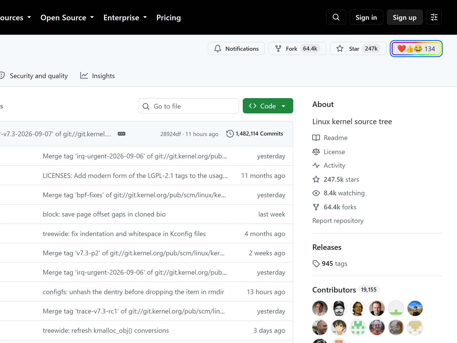
- Open a Reddit post, a YouTube video or a GitHub repository and find the Emojery button in the row.
- Switch that site into dark mode with its OWN setting, not your browser's.
- Watch the Emojery button follow, without a page reload. Its fill, its text color and its corner radius all change with the row.
- Switch the site back. The button follows again.
Make it stop matching
The popup can override the part that follows the page, which is the theme.
- Open the popup and stay on the Settings tab.
- Set Theme to Light or Dark instead of System.
- The picker now uses that palette everywhere, whatever the site is doing. Set it back to System to hand the decision to the page again.
What it copies, and from where
When the button mounts, it looks at the real controls next to it — the site's own Like, Star, Share or vote — and reads what the browser actually computed for them. Not a stylesheet we wrote for that site: the live values, on that page, at that moment.
It takes 5 things. The corner radius most of the nearby controls share, so it lands on the row's pill or square rather than on a stray wrapper. The fill, flattened through any translucent layers down to the page behind them. The text color, adjusted if the result would be unreadable. The horizontal padding, so the gaps in the row stay even. And the type: the font family and size of the nearest real label.
It also measures the row's height and the size of the site's own icons, so the emoji sits on the same baseline at the same scale instead of making the row taller.
Why that is better than a theme per site
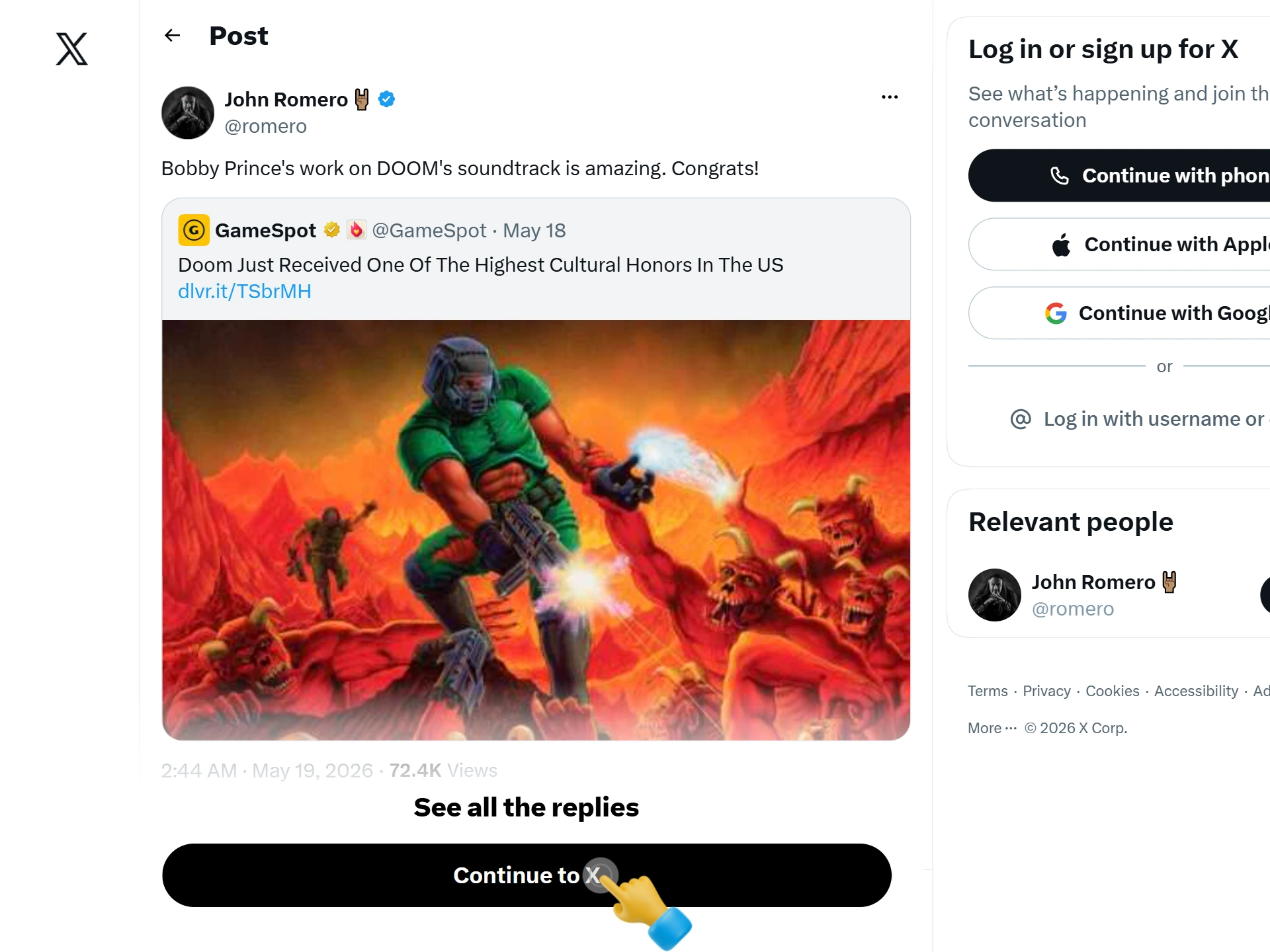
A theme written per site is a copy of how that site looked on the day somebody wrote it. Sites redesign. When Reddit or X changes its button shape, every extension carrying a hand-written theme is suddenly wearing last year's design, and stays that way until someone ships an update.
Reading the row instead means there is nothing to go stale. A redesign changes what the button copies, on the next page load, with no release from us. The same mechanism is why it also fits things nobody planned for: a site's own custom themes, a high-contrast mode, a user stylesheet, even another extension that restyles the page — all of it is just what the browser computed for the row, which is the only input.
It is also why the button looks right on a site the day support for it ships. There is no design pass per site, because there is no design per site.
How it decides light or dark
First it asks the page directly: a site that declares its color scheme is believed. If the page does not say, the brightness of its background is measured and anything below the midpoint counts as dark. If neither answers, it falls back to what your browser prefers.
That decision is not made once. The extension watches the attributes sites use to carry a theme on the page's outermost elements — the class, the inline style, and the usual theme attributes — and re-checks when one changes, within the same frame. That is what makes a site's own dark-mode switch move the button with it, live.
Where it cannot follow
Four honest limits, all of them visible rather than silent.
Colors in the newest CSS color spaces. A background written in oklch or lab is not measured for brightness, so a site using them for its page background falls back to your browser's preference instead of the page's. The button is still readable; it may just be the wrong half of the pair on a site whose theme disagrees with your system.
Backgrounds that are not a color. A photograph or a gradient behind the row is not a value that can be averaged into light or dark, so it is skipped and the next test decides.
A row it cannot read at all. If the controls next to the button are hidden or have no measurable surface, the button wears what the site looked like last time — remembered per site for a day — and its own defaults after that.
The emoji themselves. The button borrows the row's shape and colors, never its iconography: the emoji are always the same Noto artwork, on every site and every platform, because a count has to mean the same emoji everywhere. That one is a decision, not a limit.